
BRONTE BATHROOM
Completed: 2025
Interior Design: Convict Interiors
Build: MJP Projects
Photography: Joana Sousa
Words: Sam Eggleton
Mid-Century Meets Coastal Calm
This one was a bit of a Tetris challenge.
A narrow, dated bathroom in a 1960s walk-up just off Bronte Beach, with a layout that included a weird mini entrance hall and a toilet tucked into a forgotten corner. The brief? Keep it calm, timeless, and completely rework the space, without touching the structural single-brick walls.

To get the function right, we made some smart layout changes. We removed a non-structural wall and absorbed a tight hallway that served no real purpose. That small move completely opened up the room.
Then, in a move that might seem counterintuitive, we actually made the room smaller. We introduced a new stud wall, which gave us just enough depth to:
Conceal the in-wall toilet cistern
Build a shower niche into the wall cavity
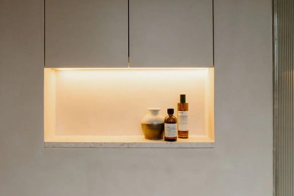
Create hidden storage above the toilet, no protrusions, no visual bulk
It’s these quiet, structural shifts that make the space feel effortless. Everything has a place, and nothing feels like an afterthought..
Reworking the Floorplan


This was never about creating a showy, glossy bathroom, it was about designing something that felt like it belonged. That felt natural in a 1960s building with beautiful bones.
The palette leans warm and textural:
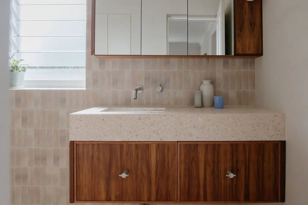
Microcement on the walls for a seamless, tactile finish
Terrazzo stone, a playful nod to the era, complementing soft sandy tones
A custom vanity wrapped in Tasmanian Blackwood timber to ground the room and bring warmth
There’s nothing trend-driven here. Just good, timeless materials that will wear in, not out.
Honouring the Building, Not Imitating It

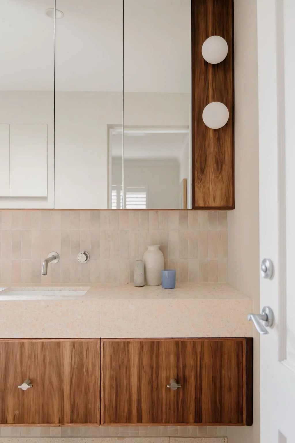
We ditched the idea of a double sink, mostly because it just doesn’t make sense unless you’ve got loads of space (and we didn’t). Instead, we offset a single basin, which gave us:
Ample bench space (finally)
A powered styling drawer tucked underneath for hair tools and clutter control
Room for asymmetrical wall sconces, positioned at face height for flattering, functional light
It feels personal. Tailored. Like someone actually thought about how the room would be used, because we did.
One Basin > Two


Overhead lighting is great for dentist surgeries, not so much for getting ready in the morning. We completely reworked the lighting to feel soft and layered:
Warm task lighting around the mirror (2700–3000K range)
Soft strip lighting below chest heigh for ambience
We also installed fluted glass in the shower, it diffuses light beautifully, softens sightlines, and adds texture without closing off the space. Think of it like jewellery, subtle, but considered.
Light That Works With You

The Wrap
The Bronte Bathroom is the kind of space we love delivering, calm, smart, and a little bit surprising.
A layout that finally works.
Finishes that sit gently in the space.
And a feeling that makes you want to close the door and stay a little longer.